- Home
- Brand
Brand guidelines
How the FH Tecnología identity is built and used: one shape, three colours, three typefaces. Everything you see here is generated from a grid and a script.
The FH Tecnología brand guidelines define the FH monogram built on a 24-unit grid, its versions, the closed palette of black, white and gold with measured contrast ratios, the three open-licence typefaces and the tone of voice. It is a public page so that any collaborator can apply the identity without interpreting it.
One column holds both letters.
The F and the H share the left stem and the crossbar. The whole construction is orthogonal except for one gesture: the 45° cut that ends the arm of the F, the facet of an ingot. Technology in the grid, judgement in the single formal decision, gold in the facet.
Three routes were explored: shared stem, reversed-out seal and continuous stroke. The first was chosen because it survives at 16 px, does not look like the usual line monograms and works as a flat-faced solid in the 3D scene on the home page.
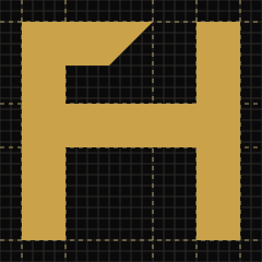
A 24-unit grid.
The letterform spans from 2 to 22. The stems are 4 u wide; the crossbar runs from 9.5 to 13.5, half a module above the geometric centre so it does not look as if it has dropped. The gap between the arm of the F and the right stem is exactly one stroke.
| Element | Coordinates (u) | Note |
|---|---|---|
| Left stem | x 2–6 · y 2–22 | Shared by F and H |
| Right stem | x 18–22 · y 2–22 | H only |
| Crossbar | x 6–18 · y 9.5–13.5 | Optical compensation of half a module |
| Arm of the F | x 6–14 top, 6–10 bottom · y 2–6 | 45° cut; 4 u gap to the right stem |
One logo, seven uses.
Text converted to outlines: no file depends on an installed font. On a gold plate, the mark is always black.










One stroke of air all around.
The clear space is one stroke of the monogram (4 u, the height of the arm of the F). Nothing enters that margin.
- Monogram
- Minimum 16 px on screen, 5 mm in print. Below 24 px, use the hand-drawn favicons.
- Horizontal
- Minimum 120 px wide, 30 mm in print.
- Vertical
- Minimum 64 px tall, 18 mm in print.
Black, white and gold. Nothing else.
Two shades of gold depending on the background: the one that shines on black does not have enough contrast on paper. Contrast ratios measured with the WCAG 2.2 formula.
- Gold #C9A24A is never used as text on paper (2.29:1). In the light theme, gold text uses #8A6510.
- On a gold plate the text is black (8.25:1), not white (2.16:1).
- In 3D, gold is a material: metal with medium roughness and a warm reflection. The highlight #F0D58A is the colour of the reflection, not a flat plane.
Three open-licence families.
Self-hosted as WOFF2 with a Latin subset and variable axes. SIL Open Font License 1.1. The prototype's choices stay: Syne has character without being a fad, Instrument Sans reads well at 16 px and JetBrains Mono gives the labels their technical voice.
- Headings
- Syne 800"FH" in the logo at 800, "Tecnología" at 700. Headings with -0.025 em letter-spacing.
- Body
- Instrument Sans 400–600Body text 16 px, line height 1.65. Buttons at 600.
- Labels
- JetBrains Mono 500Uppercase, 11.8 px, 0.12 em letter-spacing. Metadata, figures and code.
What to do and what not to do.

Direct, concrete, no hot air.
The brand speaks the way it works: with data, deadlines and deliverables that have a name. If there is no data, it says what is missing.
- Short sentences and active verbs. "We measure before touching anything", not "innovative cutting-edge solutions".
- First person singular when Felipe speaks; third person when the brand speaks. Never "we" to fake a team.
- Spanish from Spain in the original, informal address, no unnecessary anglicisms. In English: plain, direct British or international English.
- No promises that cannot be measured: no Google rankings and no savings without a baseline.
- No emojis or decorative symbols.
Tell me what you want to achieve. I reply with a proposal for the next step.
Tell me about your project